NEWSLETTER
Wpisz swój adres e-mail i zyskaj e-booka
Bez niechcianej poczty ani reklam
Tylko merytoryczne treści z obszaru digitalizacji produkcji

Let’s not kid ourselves – appearance matters. But in this case it’s not just about simple aesthetics, but something much deeper. We are talking about the way the user interacts with the system. It is this interaction that determines whether it will support daily work or become just another tool that no one wants to use. UX/UI design in the context of companies and manufacturing plants requires a completely different approach than for applications for individual users.
In this article, I’d like to take a closer look at how to create interfaces that not only look, but most importantly, work as they should.

To begin with, it’s worth writing about what UX design is, what UI design is, and to answer the question of what the differences between the two are. UX, or User Experience, is the way a user perceives and experiences using a given system. It’s not just “does something work,” but more importantly “does it work as I expect it to” and “is it comfortable and intuitive to use.”
UI, or User Interface, on the other hand, is the visual layer – the appearance of screens, button placement, colors, typography. UX focuses on feel and functionality, while UI focuses on form and aesthetics.
The two must work together. A well-designed interface not only looks neat, but most importantly supports the user in achieving his goals without distracting attention with unnecessary embellishments. UX and UI design is therefore not a matter of taste, but a tool that is essential in building effective and useful digital solutions.

When we design an app targeting a wide audience, we have an advantage: access to a wide range of user feedback. B2C apps, available to the public, are naturally tested by thousands of people. This is a huge source of knowledge, if we can use it. Users themselves report bugs, share opinions, show us what works and what doesn’t.
With systems created for businesses, the situation is different. Here the number of users is limited in advance. We are talking about dedicated applications, often operating exclusively within the organization, often installed on local servers. The users are the company’s employees – and often only them. So we can’t count on someone reporting in advance on their own what doesn’t work for them.
Therefore, a different approach to design is necessary. It should take into account the real working conditions of end users and their needs. Therefore, it is important here to design with them in mind, not for the convenience of the developer who creates the application.

Functionality is what matters most in business systems. However, we should not confuse it with a dry list of capabilities. A good interface should not only “enable you to do something,” but, above all, allow you to do it quickly, intuitively and without frustration. However, this requires advance preparation.
So already at the system planning stage it is worth designing at least basic mock-ups of interfaces. It is also good to prepare test scenarios. These are specific paths the user is supposed to take in the system to achieve a given goal. This allows you to verify at an early stage whether the design meets expectations.
Unfortunately, in B2B more often than in B2C It happens that the whole stage related to UX/UI design is treated negligently. The focus is on business logic, databases, integrations, and the design and user experience itself is a matter “for later.” The problem is that it is proper UI design that determines whether a system will be perceived as friendly and functional, or as just another tool that makes life difficult.

Get 5 chapters of the book for free!
Join the newsletter and gain access to 40% of the book
“15 Steps to Buying an Information System“.
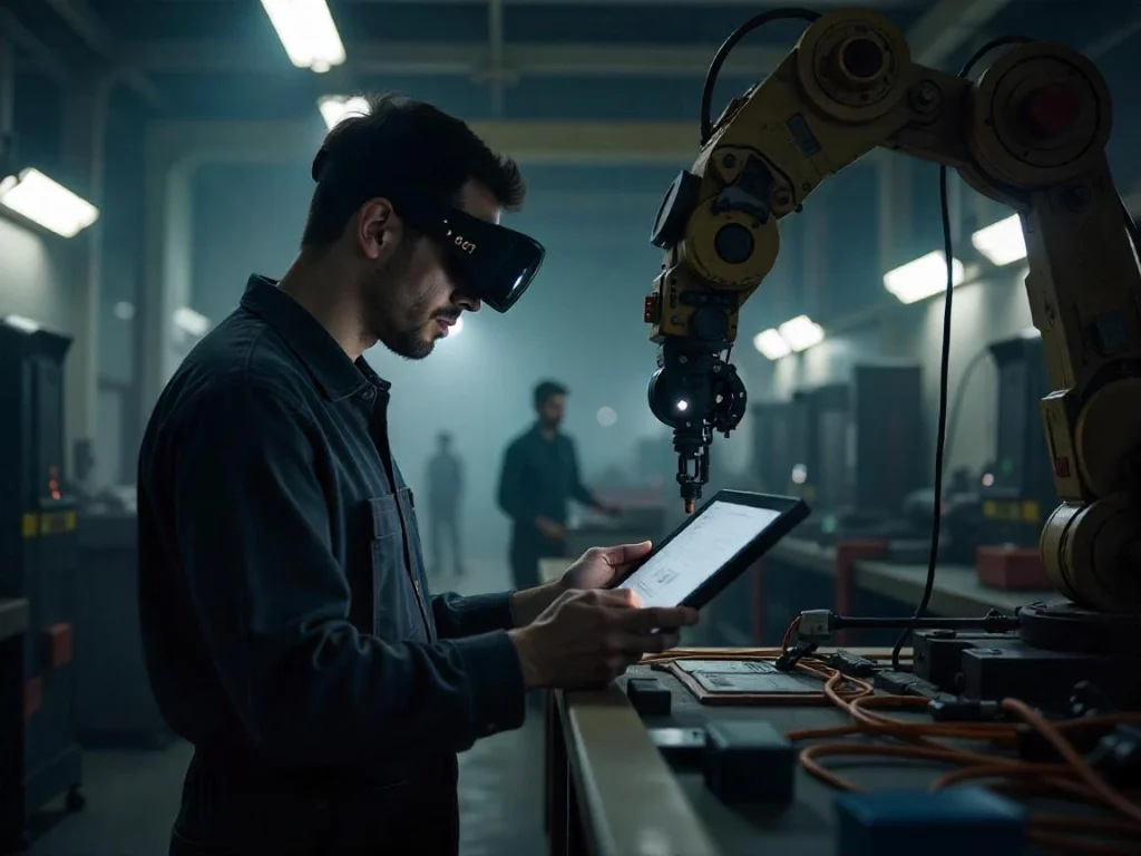
The end user is not an abstraction. It’s a concrete person who will be clicking buttons, reviewing lists and entering data every day. And not necessarily on a comfortable laptop screen, but perhaps on a touch panel on the factory floor, wearing gloves, amid noise and dust. If we ignore these conditions too soon, we may have to make costly adjustments – and sometimes even redesign the interface altogether.
Too-small buttons, too-small font, unreadable messages…. While all this may seem like a trifle, in practice it can completely block the ability to use the application. That’s why it’s so important to test the system in an environment where the application will actually be used. Then it is easier to check whether the designed interface really meets real needs.

Many projects fail to be completed at the right level because all the tasks go to one person – usually a programmer. The same person designs the database, is responsible for the application logic and draws the buttons. It’s as if one person were to come up with the recipe, cook the dish and design its appearance on the plate. Can you? One can. But is it worth it?
In a well-functioning team, responsibility for appearance ( frontend ) and functionality (backend) should be separated. Someone focuses on how the system works, someone else focuses on how it is used. And while these two worlds must work together, each requires different skills. A UX specialist doesn’t need to know how a database is structured. But he or she should know where the user expects a button to go, what his or her workday looks like and what frustrates him or her the most.

Not all system functions are equally important. In practice, the user uses a small part of the capabilities every day. The Pareto principle – 80/20 works very well here. It says that we use 20% of the functions 80% of the time. So it is worth identifying these key actions at the design stage and highlighting them accordingly.
Shortcuts, buttons, quick access, interactive elements – all save time and nerves. On the other hand, less frequently used functions can be hidden deeper in the interface. You don’t have to give them up, but it also doesn’t make sense to expose them on every screen. A well-designed interface should allow you to easily reach the options you need without overwhelming the user with an excess of information.

One of the most common mistakes is putting off UI testing until the last stage of the project. When the backend is running, the system is processing the data and everything is ready – suddenly you find that the user doesn’t know where to click. Either he can’t read the labels, or he gets confused too easily. And the running begins: quick fixes, stress, delays.
Most of these problems can be avoided if interface testing, user path design and prototyping are planned early on. The very first mockups can be shown to several people from the target team and asked: “do you know what you need to click?”, “is everything understandable?”. You don’t need hundreds of testers, sometimes even three people are enough to catch key problems.
Interaction with the system begins with the first click. If something grates at the start causing a bad user experience – an illegible login page, difficult navigation, strangely behaving buttons – it’s hard to rebuild trust later. Just like with mobile apps. If something doesn’t work, we just delete it.
In companies, this is not always an option, but the effect is similar: the user is reluctant to use a system that has once disappointed him. This is why investing in UX/UI design simply pays off. And most importantly, it allows you to create systems that people want to use. An intuitive user interface makes a real difference in productivity. We should keep this in mind when developing any application.
If this article helped you look at UX/UI design in enterprise systems from a more practical side, I invite you to the latest episode of Digitalizuj.pl!
There you’ll find more concrete examples, tips and answers to questions about creating interfaces, building user scenarios and using solutions in real-world work environments.